This is the most extensive file I have released for free to date. I’ve been toying around with the idea of a load planner for a long while. The idea behind this build was so practitioners could plan future loads and see how these planned loads would affect a:c ratios.
I think ‘predicting injury’ is going to be a far stretch. If you have previous data already, and have identified some individual risk areas, then by planning loads and managing injury risk, injury occurrences, in theory anyway, could be reduced.
This file could be part of a larger workload database, as it can show you how to plan loads for the future and how your loads are currently progressing in line with your previously planned loads. It uses collected workload data to build up a “workload profile” for each individual, so it could form part of a larger database.
*Please note all data is randomized and for demonstration only.*
I will split this post up into the different tabs in the spreadsheet for simplicity.
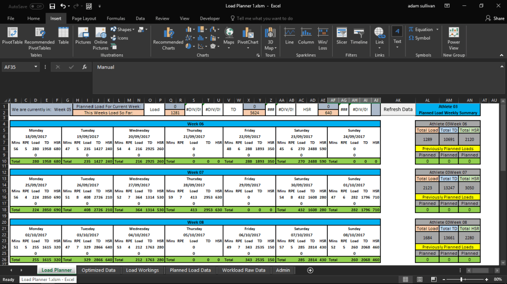
Load Planner Tab Overview.
This is where you can plan all your loads for the coming four weeks and see how it will affect a:c ratios over those four weeks, as well as look at how the weekly workload % changes, in comparison to previous data. The idea here is that you could plan up to four weeks of training or matches, by using estimates (or worst-case scenarios) for loads, based on normative values for types of sessions and matches, and see how it will affect loads and potentially injury risk.
This tab has some key features:
- A display for showing your planned load for the current week, and the % of that planned load you have achieved so far in that current week (provided you have planned for the current week previously).
- A refresh data macro button that updates the entire sheet.
- Daily grids where you can input mins, rpe, total load, total distance and high speed distance, for two sessions a day.
- Weekly summary table on the right for the planned loads, and a display to show any loads you previously planned for that week – just in case you need to change loads you had planned two or three weeks ago. So, you can compare your previous plans to your current plans.
- A drop-down box that allows you to pick from load, total distance or high speed distance, and display them on the daily chart and weekly % change chart.
- A slicer to select each athlete and show how your planned loads affect the individual load progression and a:c ratios.
- A button to load planned data into a database that stores it for your records, once you are happy with how the loads look for an athlete, then simply load the data and move onto the next athlete.
- A drop down to display the manually planned load, or use the optimizer option, based on data spat out by a load optimisation tool.


Workload Raw Data Tab.
This tab is where all previous workload raw data is stored, and helps set up some baseline data for the EWMA 28day and 7 day calculations. This is how the planned data displays future trends, by building on the previous data.

Admin Tab.
This admin tab drives the date and corresponding week formulas. This allows you to choose your start date for your first week of data. It also allows you to see individual start dates based on when your athlete starts training. As I explained here, this allows for more accurate individual workload calculations. This works by looking through the workload data you have collected already, and displaying the first date that appears for each athlete. Finally, there is an A:C low and high threshold option, which sets thresholds of your choice to display on the charts.

Load Workings Tab.
The load workings tab contains tables that calculate the A:C ratios for the three different metrics – see this post for more details on how this table functions. This main table takes all the loads from the workload raw data tab, calculates the moving averages and a:c ratios, and provides the data needed to build the visual charts in the load planner tab.


I have set up a pivot table with a three rows of data, which displays the previous 3 days workloads, moving averages and acute to chronic ratios for each athlete. I used a three day formula as I wanted to originally use the previous day alone, but if that was a rest day it would skew the future loads rolling averages etc. so three days can help avoid that.
By inserting a formula alongside the main workings table, I can filter a pivot table based on the previous 3 days values. If I enter the formula below, it will give a true or false reading on whether the date it looks up, is within 3 days before today
=AND([@Date]<=TODAY(),[@Date]>=TODAY()-3)
When I use the heading for 3 day in the pivot table as a filter, I just select the true option from the filter drop down, so it will only display values corresponding with true. I chose three days to give some back up data, in-case yesterday was a rest day of zero.

Planned Load Chart

This pivot table allows us to build a set of data that will run the 28 day planned load chart. The top 3 lines of data just copies data from the pivot table, depending on the metric selected in the load planner drop down box in cell B35. i.e to display the raw data score for a certain metric, the formula is as follows:
=IF(‘Load Planner’!$B$35=”load”,’Load Workings’!AC7,IF(‘Load Planner’!$B$35=”TD”,AG7,IF(‘Load Planner’!$B$35=”HSR”,AK7)))
I copy this across from cell AU4 to AX4, with the same formula structure, just different cell references.

You can see where this formula pulls from.

Once this formula is set in, then we can copy the data entered in the load planner tab for each date, and use manual EWMA formulas to start laying out how certain loads will affect the acute to chronic ratios going forward.

The chart below is what this data drives.

Weekly % Change Chart & Table

In a similar fashion to the previous pivot table, that displays the previous days data for each player, this pivot table also does the same, except it shows the previous 28 days for each player in weekly form. The % change formula beside the pivot table shows the % load change for each metric, depending on which metric is selected in cell B35 of the load planner tab. This % change is strictly for the % change value that displays on the current week bar of the weekly % change chart (not the planned load).
This table acts as a helper, as I copy all the data from the table into another table, where I can manipulate it a bit easier, to get the chart layout I want.
I wanted to have a chart that has different colour bars for the previous week’s worth of data, the current planned week, the current week of load and the planned weeks, hence the odd layout of headings and values scattered across the cells. These values are pulled from the pivot table above, and are again dependent on the metric you select in the load planner tab. The % change in this table is purely for previous and planned loads, not current loads.
To get % above a column in a chart, you need to add data labels, and then select the range you want these labels to come from (value from cells).


Planned Load Data Tab.
This tab stores all planned data for each athlete, to act as a reference to display planned loads for the current week in the top section of the load planner tab, as well as act as a reference to display previously planned loads and compare the two.
The idea behind this was so you could monitor the progress of these loads and see if your next weeks worth of planned loads is still relevant based on the work you have done, as you may need to change loads you had planned two or three weeks ago.
You can use this stored data to compare your previous plans to your current plans. See the top two rows and the weekly summary table to the far right of the picture below of how this displays the planned data.

This data is pulled from the weekly load summary table in the load planner (cells AL:AN) and copied into some hidden cells to the right of this table.


I recorded a macro – (see this video for a nice beginner demo on recording macros), that uses a load button to copy this data and paste it into another tab when you are happy with how the data looks on a chart. The button loads the data into the planned load tab and then moves the cursor to the next cell below in column A, so you can continue loading data.
Just be wary of what cell you may click into if you visit this tab, as you may end up overwriting data if you have selected another cell and not clicked into the next blank cell before loading more data. See how it transfers the data below.

The macro for this function that was created with the record macro button can be seen below – following the video link I left above to recording a macro, I just copied and pasted the cells I wanted to transfer into the tab I wanted to store them in. This is a useful tool to use instead of trying to code this manually.

I then just name the macro and then assign it to a form control button, that I can create in the developer tab.


You will notice I combined the athlete name and week in the hidden columns on the right side of the load planner and in the weekly summary table, as well as hidden in the planned load data tab. I didn’t want to add in index match functions so I created a helper column to make the lookup function for athlete and week a little bit quicker and easier. Hence why you might see Athlete03Week05 as one sentence in a cell.


Optimised Data Tab.
I put in this option to test out a load optimiser tool I previously built here. I wanted to be able to select either manual data, entered in the grids on the load planner tab, or choose to use optimized data, to compare each method.

I modified the optimiser to work with 28 days of data, so it would fit in with the amount of days we can plan in this file. I can just copy what the optimizer spits out, and paste it into the optimised data tab. This modified version will be included in the download.


I can only optimise one variable at a time, but I can go back, change the constraint to suit something like total distance, and then paste that data into the TD column of the optimised tab. Please note this optimiser is not the perfect loading solution, but a nice example of the possibilities.


All the formulas in the total (green) columns will either sum the data above them if manual is chosen, or else display the value from the corresponding cell in the optimiser tab, as long as your start date in the optimser data tab is the same as the first date in the planned load tab, then the data will match up perfectly.
=IF($AF$35=”manual”,SUM(S32:S33),’Optimized Data’!$C26)

Load Planner Tab – Workings.
Most of the workings for this main tab happen in the other tabs, and have been explained already. There aren’t many complicated formulas in this database, just a bit of careful planning.
The top section of the load planner tab, has a small display with status bars. This tells you the load for the current week so far, and how that compares with what you had planned for the current week. You wouldn’t rely on this as your analysis, but it could be used in conjunction with a more detailed workload analysis spreadsheet, or you could incorporate this sheet into another database.


The weekly load summary tab has a simple if function for each variable, if manual is selected in the dropdown box, it will add up the cells with total load for each day, otherwise it will sum a range in the optimiser tab that would be the first week of optimised data. This is the formula for the picture below.
=IF(AF35=”Manual”, SUM(D10+I10+N10+S10+X10+AC10+AH10), SUM(‘Optimized Data’!C3:C8))
The same pattern continues for each week and variable.

The slicer changes the pivot tables, which drive all the data behind the planned charts, this just controls two small pivot tables, which drive all the data.

I went through the data labels for the % weekly change chart previously, but to note, the current week % change is the workload that has been done in this week and the % change represents the change between this week and the previous week.
The current week planned represents the change in what you had planned versus the previous week that was done, just so there is no confusion.

Would really love to hear feedback on this and suggestions for improvement as definitely want to keep exploring the space on this.
Check out the download here
